
Why I stopped building them to save decision velocity
Dashboards often create "Insight Paralysis" slowing down business decisions. Discover why shifting from data volume to Decision Intelligence increases business value, improves decision velocity, and supports data-driven leadership.
I remember the very moment I realized I was building the wrong thing. It was a Monday morning quarterly business review with one of the large manufacturing clients in their office. I was sitting there, nursing a warm coffee, watching two VPs argue. On the screen, there were three different dashboards. Sales showed revenue was up. Marketing showed leads were down. Finance was just shaking their head because the margins didn’t match either of them.
I had invested months building those data pipelines. I thought, "If I just give them the numbers, they’ll know what to do." Instead, I watched them freeze. They weren't making decisions faster. They were just arguing about the metrics with better graphics. That was when I realized the hard truth: I had built a Ferrari engine of data, but we were stuck in traffic because we forgot how to actually drive the decision-making process.
The shift: from scarcity to "Insight Paralysis"
The biggest shift I’ve observed in our industry isn't AI - it’s the shift from scarcity to abundance. Five years ago, I remember begging IT teams for a report. The constraint was volume. Today, the constraint is attention.
I’ve watched organizations democratize data to the point that we’ve accidentally created a Tower of Babel. The industry data backs this up: studies show that employees now spend up to 10 hours a week just searching for the right data. Yet, shockingly, 76% admit they still make decisions without it because the insights remain too hard to access. I see this constantly: a CEO asks, "Is this product profitable?" and gets three different answers depending on who ran the SQL query. This isn’t "data-driven." This is Insight Paralysis.
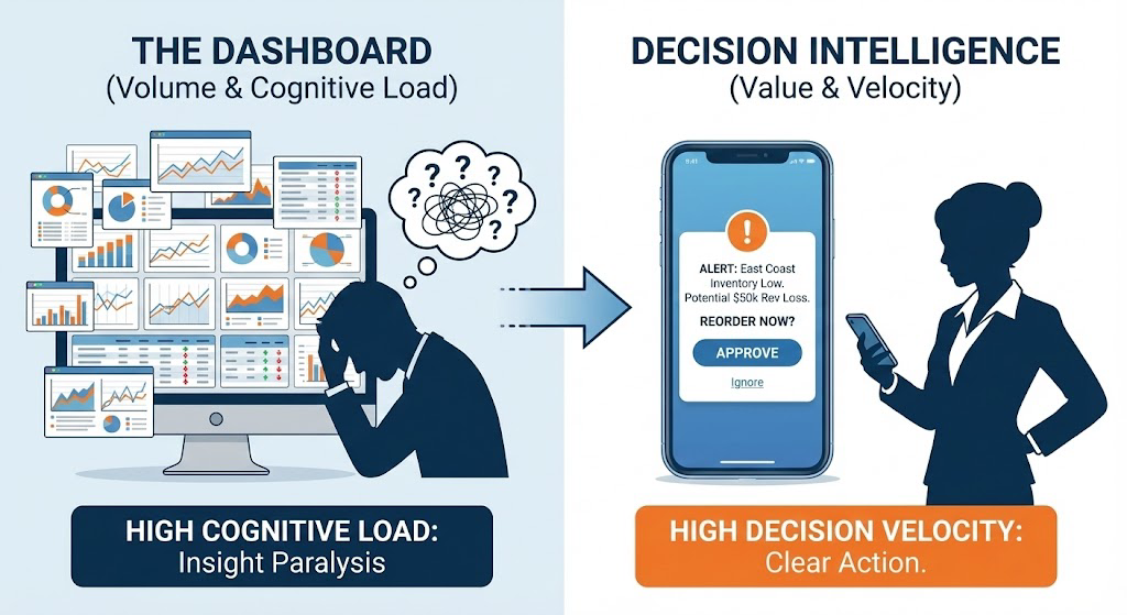
I used to measure my team’s success by how many dashboards we shipped. Now, I look back at some of those "Executive Command Centers" - beautiful, complex, and totally unused - and I realize we were measuring activity, not value.
The context gap
Don't get me wrong - I love technology. Modern platforms can ingest millions of rows in seconds. But here is the messy truth I’ve learned: Tech has zero context.
I saw this recently with a retail client. Their dashboard showed "Inventory Turnover" was healthy (Green Light). But the dashboard didn't know that the "healthy" number was driven by low-margin clearance items, while their best sellers were out of stock. The numbers were right; the business reality was wrong. Observed a similar thing with a manufacturing client. A dashboard reported 98% machine uptime. It looked great. But the 2% downtime happened exactly during the peak rush, costing millions.
The tech gives us the signal, but it can’t filter the noise. When we expect the tool to do the thinking for us, we miss the story behind the numbers.
So, Where do we go from here?
If you’re a business leader focused on analytics in 2026, it’s time to recognize that the era of the "General Purpose Dashboard" is ending. Industry experts forecast that by 2028, over 60% of dashboards will be replaced by AI-powered data storytelling, automated insights, and actionable data visualization. Leading the way requires adopting new approaches to data-driven decision-making.
I am now advising my clients to pivot toward Decision Intelligence. Instead of building generic dashboards that show everything (just in case), we need to build interfaces that recommend one action. Visualize a system that doesn't just show you "Inventory Levels." Instead, it says: "Stock is low in the East Coast warehouse. If you don't reorder by Tuesday, you will miss $50k in revenue. Click here to approve the PO."
That’s the difference. That’s moving from "Data" to "Decisions." But until technology improves there, you have a job to do. Next time you’re in that Monday meeting, and someone puts up a slide with fifty numbers on it, don't ask for more detail. Ask them this: "Which of these charts actually helped me make a decision last week?" If the answer is "none," delete it. And go enjoy your coffee.